Blakimage
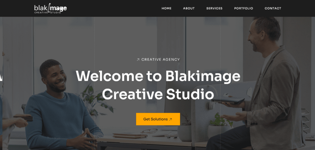
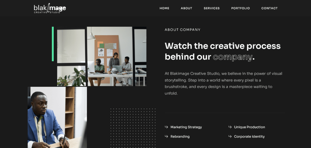
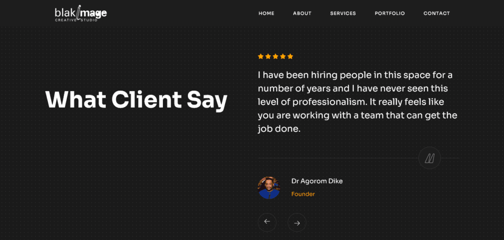
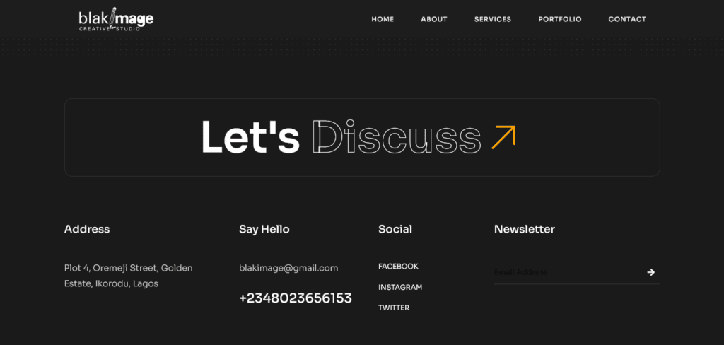
Blakimage is a creative agency specializing in brand identity, digital experiences, and print materials. We designed their website and made it easy, fast, and mobile responsive.
Services
- Web Design
- Web Maintenance


Client Objectives:
- Enhance Brand Identity: Reflect Blakimage’s unique identity and creative prowess through the website design.
- Improve User Experience: Ensure a seamless and intuitive browsing experience for visitors, leading to increased engagement and conversions.
- Showcase Portfolio: Highlight past projects and case studies effectively to demonstrate the agency’s capabilities and expertise.
- Incorporate a Black and Orange Color Scheme: Utilize a striking colour palette that aligns with the brand’s identity and stands out to visitors.
Our Approach:
- Discovery Phase: We conducted in-depth discussions with the Blakimage team to understand their brand identity, target audience, and desired website functionalities. This phase also involved analyzing competitors and identifying key design elements for inspiration.
- Design Concept Development: Leveraging the insights gained from the discovery phase, we crafted multiple design concepts focusing on incorporating the black and orange colour scheme. These concepts explored various layouts, typography styles, and visual elements to ensure alignment with Blakimage’s brand identity.
- Iterative Design Process: Through collaboration and feedback sessions with the Blakimage team, we refined the chosen design concept iteratively. This process involved fine-tuning colour combinations, layout structures, and interactive elements to achieve the desired aesthetic appeal and functionality.
- Custom Development: Our team of developers translated the finalized design into a fully functional website using the latest web development technologies. We ensured seamless responsiveness across different devices and browsers to deliver a consistent user experience.
- Content Integration: Working closely with the Blakimage team, we integrated compelling content, including portfolio showcases, case studies, and service offerings, to effectively communicate the agency’s expertise and value proposition to visitors.
- Testing and Optimization: Before the website launch, we conducted rigorous testing to identify and address any performance issues or usability concerns. This phase also involved implementing optimization techniques to enhance site speed and overall user experience.
Results:
- Enhanced Brand Identity: The revamped website effectively captures Blakimage’s creative spirit and brand personality through its visually striking design and cohesive colour scheme.
- Improved User Experience: Visitors to the website now enjoy a seamless browsing experience, with intuitive navigation and engaging interactive elements contributing to increased engagement and longer session durations.
- Showcased Portfolio: The portfolio section of the website showcases Blakimage’s diverse range of projects and case studies, providing visitors with tangible examples of the agency’s expertise and successful collaborations.
- Black and Orange Color Scheme: By incorporating the black and orange colour scheme throughout the website, we achieved a bold and impactful visual presence that not only aligns with Blakimage’s brand identity but also helps the agency stand out in a crowded market.