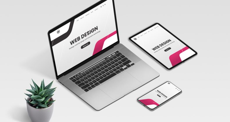
In today’s digital landscape, where attention spans are fleeting and competition is fierce, having a website that not only attracts visitors but also keeps them engaged is paramount. This is where website usability comes into play. From optimizing navigation to enhancing mobile responsiveness and implementing clear calls-to-action (CTAs), several strategies can significantly improve the user experience (UX) of your website. In this article, we’ll delve into these key elements and explore actionable steps to elevate your website’s usability to new heights.
I. Introduction
A. Importance of Website Usability
Website usability refers to how easily and effectively users can interact with a website to achieve their goals. A website with poor usability can lead to frustration, high bounce rates, and ultimately, loss of potential customers. Therefore, prioritizing usability is essential for creating a positive user experience and driving conversions.
B. Overview of Key Elements
Improving website usability includes optimizing navigation, enhancing mobile responsiveness, and implementing clear calls-to-action. Each element plays a crucial role in ensuring visitors can navigate your site effortlessly and take the desired actions.
II. Optimizing Navigation
A. Simplifying Menu Structures
A cluttered and complex menu structure can overwhelm users and make it challenging for them to find what they’re looking for. By simplifying your menu structure and organizing content logically, you can streamline the navigation process and guide users to the information they need more efficiently.
B. Implementing Search Functionality
In addition to a well-organized menu, incorporating search functionality allows users to quickly locate specific content or products. Integrating a robust search feature with auto-suggest capabilities can significantly enhance the user experience, especially for sites with extensive content or product catalogues.
C. Utilizing Breadcrumbs
Breadcrumbs provide users with clear navigation paths and help them understand their current location within the website hierarchy. By displaying a trail of links that show the user’s journey from the homepage to the current page, breadcrumbs improve navigational clarity and make it easier for users to backtrack or explore related content.
III. Enhancing Mobile Responsiveness
A. Importance of Mobile-Friendly Design
With an increasing number of users accessing the web on mobile devices, having a mobile-friendly website is no longer optional—it’s a necessity. Mobile-responsive design ensures that your site adapts seamlessly to different screen sizes and devices, providing users with a consistent and optimized experience across all platforms.
B. Responsive Layouts and Grid Systems
Responsive layouts and grid systems allow website content to reflow and adjust dynamically based on the user’s device and screen size. By utilizing flexible grids, images, and media queries, you can create a fluid and visually appealing layout that remains functional and accessible on desktops, tablets, and smartphones alike.
C. Optimizing Images and Media for Mobile
Large images and videos can significantly impact page load times, especially on mobile devices with slower internet connections. To improve mobile responsiveness, optimize images and media files for size and format, and consider lazy loading techniques to defer the loading of non-essential content until it’s needed.
IV. Implementing Clear Calls-to-Action
A. Importance of CTAs in Driving Conversions
Calls-to-action (CTAs) are the driving force behind conversions on your website. Whether it’s making a purchase, signing up for a newsletter, or downloading a resource, clear and compelling CTAs prompt users to take the desired action and move through the conversion funnel.
B. Designing Eye-Catching CTAs
Effective CTAs are visually distinct, persuasive, and placed strategically within the content hierarchy. Use contrasting colours, compelling copy, and enticing visuals to draw attention to your CTAs and make them stand out on the page.
C. Placing CTAs Strategically Throughout the Website
In addition to standalone CTAs on product pages or landing pages, strategically place CTAs throughout your website to guide users along their journey. Whether it’s in the header, footer, sidebar, or within blog posts, ensure that CTAs are contextually relevant and aligned with the user’s intent.
V. Testing and Iterating for Continuous Improvement
A. Conducting Usability Testing
Usability testing involves gathering feedback from real users to evaluate the effectiveness and user-friendliness of your website. Through user interviews, A/B testing, and heatmaps, you can identify pain points, gather insights, and make informed decisions to improve usability.
B. Analyzing User Feedback
Listening to user feedback is crucial for understanding user needs and preferences. Whether it’s through surveys, feedback forms, or social media channels, actively solicit feedback from your audience and use it to inform your website’s design and functionality.
C. Iterating Based on Data and Insights
Continuous iteration is key to maintaining and improving website usability over time. By analyzing data, monitoring performance metrics, and staying attuned to industry trends, you can identify areas for improvement and implement iterative changes to enhance the user experience.
VI. Conclusion
A. Recap of Key Points
Improving website usability is a multifaceted endeavour that involves optimizing navigation, enhancing mobile responsiveness, and implementing clear calls to action. By prioritizing usability and adopting user-centric design principles, you can create a website that delights users, drives conversions, and fosters long-term success.
B. Emphasis on Constant Iteration for Enhanced Usability
Remember that website usability is not a one-time effort but an ongoing process of refinement and improvement. By continuously testing, analyzing, and iterating, you can ensure that your website remains user-friendly, relevant, and effective in meeting the evolving needs of your audience.


