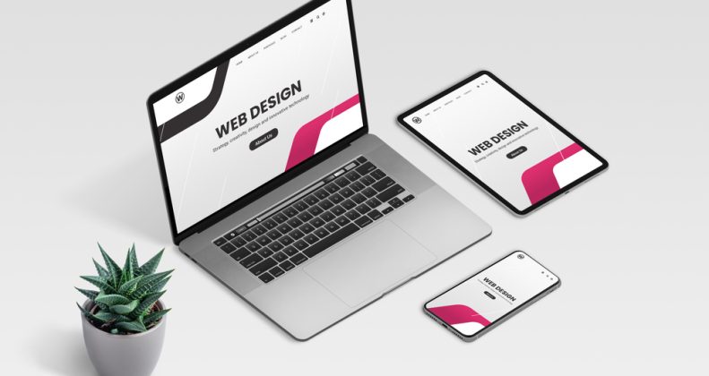
With the increasing use of mobile devices and tablets, websites need to be optimized for all screen sizes. Responsive web design (RWD) is a design approach that allows websites to adapt to the user’s screen size and device, providing an optimal user experience regardless of the device being used. In this blog post, we’ll explore everything you need to know about responsive web design.
What is Responsive Web Design? – Responsive web design is a design approach that allows websites to adapt to the user’s screen size and device. This means that the website’s layout, content, and features are optimized for the user’s device, providing a seamless user experience across devices.
Why is Responsive Web Design Important? – With the increasing use of mobile devices and tablets, it’s essential for websites to be optimized for all screen sizes. Responsive web design ensures that your website is accessible and easy to use, regardless of the device being used.
Key Components of Responsive Web Design – Responsive web design involves a number of key components, including flexible layouts, fluid images, and media queries.
Flexible layouts allow content to adapt to the user’s screen size, while fluid images ensure that images are optimized for the user’s device. Media queries allow designers to specify different styles for different devices.
Challenges of Responsive Web Design – While responsive web design provides a number of benefits, it also poses some challenges. One of the main challenges is ensuring that the website’s design and content are optimized for all screen sizes, which can require a significant amount of testing and optimization.
Best Practices for Responsive Web Design – To ensure that your website is optimized for all screen sizes, it’s important to follow best practices for responsive web design. This includes using a mobile-first design approach, optimizing images for smaller screens, and testing your website on a range of devices and screen sizes.
Tools for Responsive Web Design – There are a number of tools and resources available for responsive web design, including frameworks like Bootstrap and Foundation, and testing tools like BrowserStack and Responsinator.
Common Responsive Web Design Mistakes to Avoid – While responsive web design provides a number of benefits, there are also some common mistakes to avoid. These include using fixed widths instead of flexible layouts, using images that are too large for smaller screens, and failing to optimize content for different devices.
By understanding the key principles of responsive web design, following best practices, and using the right tools and resources, you can create websites that provide an optimal user experience across all devices and screen sizes.